
The Art And Science Of Data Visualization In Biological Research – Part I
The landscape of life science research has been transformed by the ability to generate vast and intricate datasets, a revolution sparked by the genomics era. The completion of the Human Genome Project in 2003 was a landmark achievement, showcasing the power of high-throughput sequencing to map the entire human genome. This milestone catalyzed rapid advancements in sequencing technologies, reducing costs and accelerating data production, enabling researchers to amass genomic data at an unprecedented scale. The impact has expanded across omics disciplines, transcriptomics, proteomics, epigenomics, and metabolomics, each generating voluminous datasets that deepen our understanding of biological systems at the molecular level.
In life sciences, data is everywhere, but making sense of it, that is where visualization steps in. As biological data grows in complexity, visualization doesn’t just clarify; it catalyzes. In this multi-part series, we will trace the journey of data visualization in life sciences, exploring its historical foundations, current innovations, and transformative impact on biological research.
The Data Landscape of Life Science Research
The advent of high-throughput technologies has propelled life science research into an era of massive data generation, producing intricate datasets that illuminate the molecular foundations of life. Major categories of these data include:
- Sequencing data: As outputs of high-throughput methods like Next-Generation Sequencing (NGS), sequencing data serve as the foundation of genomic and transcriptomic research.
- Omics data: Encompassing genomics, transcriptomics, proteomics, epigenomics, and metabolomics, these datasets provide comprehensive molecular snapshots of biological systems.
- Imaging data: Obtained from techniques such as microscopy, MRI, and CT scans, this type of data offer visual representations of biological structures and processes across cellular, tissue, and organismal levels.
- Ecological data: Including information on biodiversity, population dynamics, and environmental interactions, these datasets are essential for understanding ecosystems and guiding conservation strategies.
- Clinical data: Derived from electronic health records, clinical trials, and physiological readings from wearable devices, this type of data offer insights into patient health and disease progression.
- Data from behavioral biology studies: Collected through studies of human or animal behavior, often using observational methods, sensors, or video-based analyses.
Among these, omics datasets, containing thousands to millions of molecular measurements, are particularly challenging. All of these data types, often massive in scale and complex in structure, require advanced computational and visualization tools to uncover meaningful patterns and trends, and to translate them into actionable insights
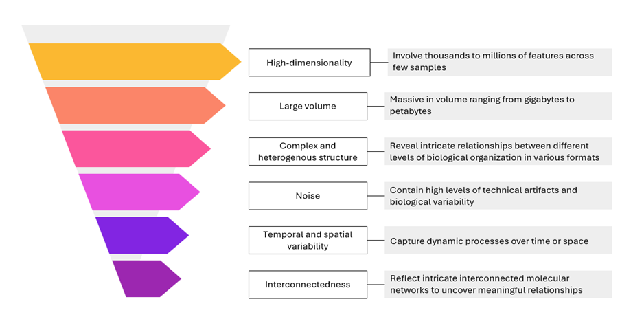
Figure 1: Characteristics of omics data
The Critical Role of Data Visualization
Life science research generates vast and multifaceted datasets, often characterized by high dimensionality and interconnected variables. For instance, genomic data may include information about DNA sequences, genetic variants, and regulatory elements, while clinical trials often involve longitudinal patient data across numerous variables. In their raw form, such data are frequently unintelligible. Robust analysis and effective visualization are essential for translating this complexity into actionable insights. They empower researchers to uncover hidden patterns, navigate multidimensional datasets, and accelerate discovery.
Thus, the ability of modern tools to present data in intuitive formats is crucial for understanding complex biological phenomena, from gene regulatory networks to cellular heterogeneity. In the section below, we explore in detail why data visualization plays such a pivotal role in life science research.
(i) Enhances scientific interpretation and dissemination
One of the most valuable contributions of data visualization in life science research is its power to improve comprehension and facilitate effective communication. Scientific findings often need to be conveyed to a diverse range of audiences, fellow researchers, clinicians, policymakers, and the general public, each with varying levels of scientific literacy. Visualization serves as a bridge across this knowledge gap by translating complex datasets into clear, intuitive formats. For instance, a simple line graph illustrating disease progression over time can communicate insights far more effectively than a dense table of numerical data. This clarity is especially important in life science presentations, where conveying subtle patterns or critical changes can have significant implications.
Well-crafted visualizations, such as infographics or data dashboards, distill complex concepts into digestible insights. They make scientific findings more approachable, encouraging understanding and informed action among non-specialists. Moreover, visual content enhances cognitive retention, as the human brain is wired to process and recall images more efficiently than text. This cognitive advantage positions data visualization as a strategic communication tool, one that strengthens message retention across varied audiences.

Figure 2: A sample data dashboard that translates complex concepts into clear, digestible insights for diverse audiences.
(ii) Facilitates exploratory data analysis (EDA) and hypothesis generation
Data visualization plays a vital role in Exploratory Data Analysis (EDA), the initial phase of research where scientists assess data structure, quality, and key features before conducting formal analyses. In life science studies where datasets are often complex and multidimensional, visual tools help researchers detect issues such as outliers, missing values, inconsistent distributions, or data anomalies that may otherwise go unnoticed. Visual inspection can reveal local patterns, clustering, gaps, or rounding artifacts that might escape purely statistical review.
Beyond this, visualization is a powerful driver of hypothesis generation. It highlights complex relationships and patterns in an accessible format, enabling researchers to formulate meaningful scientific questions and identify connections worth exploring. For example, network graphs can reveal the architecture of protein-protein interactions or gene regulatory pathways, offering insights into potential biological functions or molecular mechanisms.
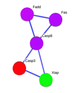
Adapted from:Ghosh S, et al. Sci Rep. 2015;5:14438.
Figure 3: Network graph of protein-protein interactions involving Fas, FADD, Casp8, Casp3, and XIAP, estimated using the STRING 9.1 database with a confidence level of 95%. The nodes (circles) represent these proteins, with Fas, FADD, and Casp8 in purple, Casp3 in red, and XIAP in green. The edges (lines) indicate direct interactions between them, forming a pathway: Fas connects to FADD, which links to Casp8, then to Casp3, and finally to XIAP.
In single-cell omics, interactive visualization platforms allow dynamic exploration of scRNA-seq data, researchers can zoom into specific cell populations, compare gene expression profiles, or track phenotypic transitions in real-time. This interactivity is instrumental in uncovering novel cell types in cancer studies or mapping cellular differentiation in developmental biology. Such insights form the foundation for experimental validation and guide deeper investigation.
(iii) Supports decision-making in applied research
In life sciences, decisions often have significant implications, such as in drug development, clinical trials, and public health policy. Through data visualization, intricate statistical outcomes become insights that resonate with scientists as well as clinicians, policymakers, and other decision-makers. For instance, a simple comparative graph showing drug efficacy versus a placebo can provide compelling visual evidence to guide clinical strategies or influence future research directions.
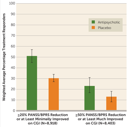
Adapted from:Leucht S, et al. Am J Psychiatry. 2017;174(10):927–942.
Figure 4: Proportion of patients receiving antipsychotics or placebo who showed at least minimal or much improvement post-treatment. Error bars correspond to 95% credible intervals.
(PANSS: Positive and Negative Syndrome Scale; BPRS: Brief Psychiatric Rating Scale; CGI: Clinical Global Impressions Scale improvement rating. All these are psychiatric rating scales used to assess the severity and improvement of symptoms in individuals with mental disorders, particularly schizophrenia.)
Visualization brings clarity to complex datasets, enhancing the reliability of scientific conclusions and supporting well-informed decision-making. Such clarity is especially vital in contexts where decisions influence patient care, clinical guidelines, or the allocation of critical resources.
Key Challenges in Visualizing Complex Biological Data
We have seen just how vital data visualization is in life science research. But is it easy? Definitely not. These datasets, produced by high-throughput technologies, are incredibly complex and diverse. Visualizing them involves more than just creating charts; it requires deep technical and domain expertise. In this section, we will explore the core challenges that make biological data visualization so demanding, examine the reasons behind them, and discuss their impact, with a special focus on omics datasets.
(i) The curse of dimensionality
Omics datasets often contain thousands—sometimes millions—of molecular features, resulting in a high-dimensional data space that is difficult to reduce into a format suitable for human interpretation. Traditional visualization techniques such as scatter plots and bar charts fall short when it comes to conveying complex relationships among such a vast number of variables.
Each omics layer, whether genomics, transcriptomics, proteomics, or metabolomics, offers distinct yet complementary insights. When multiple omics types are combined, especially at the single-cell level, the dimensionality problem is significantly amplified. Visualizing this multi-layered information in a way that preserves both cell-specific and omics-specific patterns requires sophisticated tools and techniques.
The challenge grows further when integrating clinical data with omics datasets. Clinical variables such as patient demographics, treatment outcomes, or biomarker levels introduce additional layers of complexity. The result is an even higher-dimensional space that demands advanced visualization strategies capable of highlighting meaningful patterns without overwhelming the viewer.
(ii) Scalability issues
The vast scale of modern omics datasets, particularly those from single-cell and spatial technologies, presents substantial challenges for visualization tools. These datasets can involve millions of cells or large tissue regions, resulting in files that may span several terabytes. Most visualization platforms are not optimized to handle such volume, often leading to slow performance or limited interactivity. This creates bottlenecks in research workflows, especially during exploratory or real-time analysis.
(iii) Interpretability and usability
Effective visualizations must strike a balance between scientific rigor and accessibility, particularly within the interdisciplinary landscape of life sciences. Audiences such as wet-lab researchers, clinicians, and policymakers may not have formal training in bioinformatics or data visualization. As a result, overly complex visuals can obscure key insights, while oversimplified representations risk omitting important details. Stakeholders in clinical research, for example, depend on visualizations that can translate complex findings from research studies into actionable insights for patient care.
(iv) Finding the right fit
The abundance of specialized visualization tools, each with unique strengths, limitations, and input requirements, makes selecting and applying the right tool a challenging task. Tools such as Giotto, MOFA, LIGER, and Seurat3 are tailored to specific use cases, but they often require different data formats (e.g., GTF files for Seurat3, BED files for LIGER) and come with steep or varying learning curves. Navigating this fragmented landscape demands technical expertise and significant time investment, increasing the likelihood of errors or suboptimal tool choices, particularly for researchers unfamiliar with the nuances of each platform.
This wraps up our look at the complexities of visualizing life science data. But how are these challenges being addressed? What tools and techniques are making an impact? And what recent innovations are pushing the boundaries? Stay tuned for Part 2, where we explore the solutions, strategies, and state-of-the-art advancements in this evolving field.
References:
1. Gehlenborg N, O’Donoghue S, Baliga N, et al. Visualization of omics data for systems biology. Nat Methods.2010; 7 (Suppl 3), S56–S68 (2010). https://doi.org/10.1038/nmeth.1436
2. O’Donoghue SI. Grand Challenges in Bioinformatics Data Visualization. Front Bioinform. 2021;1:669186. doi: 10.3389/fbinf.2021.669186
3. Chen H, Albergante L, Hsu JY, et al. Single-cell trajectories reconstruction, exploration and mapping of omics data with STREAM. Nat Commun.2019;10:1903. https://doi.org/10.1038/s41467-019-09670-4
4. Yuan GC, Cai L, Elowitz M, et al. Challenges and emerging directions in single-cell analysis. Genome Biol. 2017; 18: 84. https://doi.org/10.1186/s13059-017-1218-y
5. Massimino M, Martorana F, Stella S, et al. Single-Cell Analysis in the Omics Era: Technologies and Applications in Cancer. Genes (Basel). 2023;14(7):1330. doi:10.3390/genes14071330
6. López de Maturana E, Alonso L, Alarcón P, et al. Challenges in the Integration of Omics and Non-Omics Data. Genes (Basel). 2019;10(3):238. doi:10.3390/genes10030238
7. Committee on the Review of Omics-Based Tests for Predicting Patient Outcomes in Clinical Trials; Board on Health Care Services; Board on Health Sciences Policy; Institute of Medicine; Micheel CM, Nass SJ, Omenn GS, editors. Evolution of Translational Omics: Lessons Learned and the Path Forward. Washington (DC): National Academies Press (US); 2012 Mar 23. 2, Omics-Based Clinical Discovery: Science, Technology, and Applications. Available from: https://www.ncbi.nlm.nih.gov/books/NBK202165/